Have you ever wondered about the colors that show up in the stores season after season? How they are chosen? Who has a voice in choosing them? Although there are other color research companies, I’m using Pantone because they are largest and most well known for research and color trends. Here’s a short history.
The Pantone Color Institute studies color trends throughout the year in order to decide on the next Pantone Color of the Year. They take into consideration all aspects of society: fashion, marketing, social media and even politics. The hue chosen as Color of the Year has become increasingly influential in the vast world of design and brand marketing. What started off as an “afterthought” that was discussed between a few individuals in the fourth quarter of the year has transformed into a 20-person team – the Pantone Color Institute – that begins global research early in the spring, looking for recurring patterns or colors in daily life situations. The process now takes nearly nine months. Pantone states that the Color of the Year is actually “…a color snapshot of what we see taking place in our global culture that serves as an expression of a mood and an attitude.”
The Pantone Color of the Year is a color trend forecast for the consumer, which means that it’s intended to be used for consumer products and designs created for clients. Some creative brands renew their look every year according to the new color, but most businesses cannot handle that much change.
The first Color of the Year was selected back in 2000, but it wasn’t until 2007 that the color trend forecasting took on a life of its own. Nowadays, when a new color is announced, Pantone offers color lovers an array of inspirational products and color combination palettes designed especially with the corresponding color in mind.
Hundreds of brands take on the task of designing products with the Color of the Year. This reinforces the importance of how the Pantone color trend forecast is important and influential.
HOW THE COLOR OF THE YEAR CAN BE USED IN DIFFERENT INDUSTRIES
- Clothing companies design garments
- Makeup companies can create a collection
- Cake and dessert businesses create delicacies to coordinate with weddings
- Graphic designers sell ready-to-use designs to create templates or social media graphics
- Home goods and decorative prints
- Interior designers refer to for decorative pieces to their clients
- Merchandising companies for their products
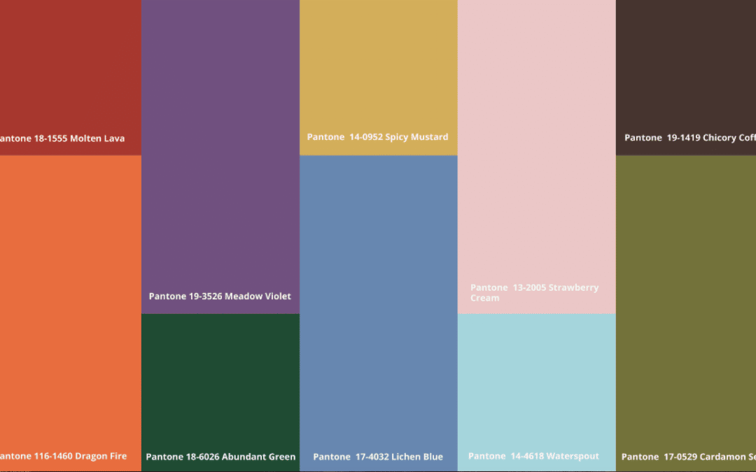
2023 PANTONE COLORS OF THE YEAR
This is what Pantone has to say about the Autumn/Winter 2022/2023 Color Palette:
Timeless tones and artful brights embrace our contrasting desire for serenity and stability with energy and excitement.
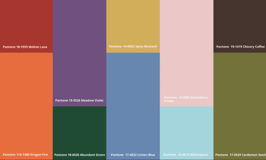
2023 PANTONE COLORS OF THE YEAR – CORE CLASSICS
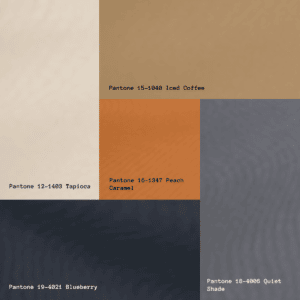
YOUR PERSONAL COLORS VERSUS THE COLORS OF THE YEAR
Do these colors represent your personal color harmony? Are there one or two found on your palette? Is there a neutral that could be the workhorse of your wardrobe? What about accessories? Remember to look at all the swatches on each of your sticks (that very last swatch at the bottom might hold a surprise).
Occasionally I’m asked by a new color client, “will I be able to find these colors?”
That’s a valid question based on the rhythm of the fashion industry (every four months, following the seasons, but out-of-sync with the current season, leaving most of us befuddled and feeling behind) and the colors chosen each year by Pantone that most fashion designers and merchandisers use. The Pantone yearly colors generally include warm and cool hues, along with pastels and their core classics. Most likely you won’t have all the colors they provide each year, but if you can find one, possibly two, stock up. Why? Because the color cycle is such that it might be several years before your color(s) come around again. This timing can leave you with “color holes” in your wardrobe for awhile. In fact, I just found one of my greens two weeks ago after four years of looking.
Pantone’s yearly palettes key off the primary colors — red, yellow and blue and then apply a wash, tint, muted, toasted or shaded color to arrive at their colors for the year. So, it helps to understand if your color palette is Clear (Spring), Muted (Summer), Toasted (Autumn) or Shaded (Winter). Their Core Classic colors follow the same practice and are often good for using as neutrals.
The color of the year is very often paired with the current trend, so this can be somewhat daunting when shopping. Not only must you filter through the colors, but you have to buck the trends too. Remember YOUR color palette is the key for you. If it’s not your color, you have permission to walk away. YOUR style is the key to sticking with what works for your personality and body shape, thus bypassing trends.
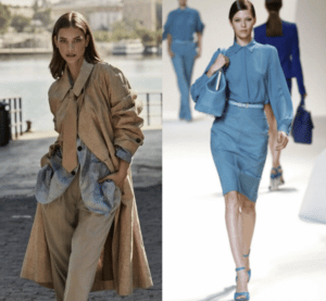 If these are your colors, but not your style, how can you be inspired by them, and re-create an outfit that supports your personality and style?
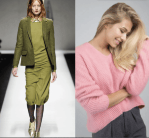
What if these outfits speak to your personality and style, but you can’t find them in your colors? What is your next step?
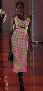
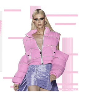
What could you do to re-interpret this outfit for you? What two colors would you combine?Would you add a blouse? What shoes would you wear?
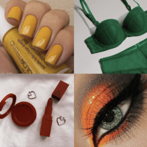
Color and wardrobe success often show up when using a focused wardrobe plan that includes an eye out for your colors and knowing which garments you need for your wardrobe and in what colors. When those colors arrive in the stores, you’re ready for mindful shopping! If you shop in secondhand stores or online you can often find previous Pantone colors of the year that will harmonize with your color palette, along with previous popular styles.
Sources:
- http://www.nytimes.com/2016/12/08/fashion/color-of-the-year-2017-pantone-greenery.html?_r=0/
- http://www.forbes.com/sites/karenhua/2016/12/09/pantones-color-of-the-year-2017-greenery-symbolizes-a-fresh-start-fashion/#395722321cda
- dress-mag.com
- Pinterest.com
To Your Mindful Aging and Mature Beauty and Style,
Denise

